Grupo Americana
Branding project unifying four pharmaceutical brands into a clean, health-driven identity that feels more innovative, trustworthy, and strong.
00

Problem
The merger of four established pharmaceutical companies resulted in a fragmented identity that made it difficult for distributors and pharmacy buyers to clearly understand the full scope of products and services. The lack of a unified system affected trust and efficiency when sourcing and distributing medicines across the country.
Solution
A clean, health-driven visual identity was developed to unify the brands under one cohesive system, making product offerings clearer and easier to navigate. This strengthened trust with pharmaceutical customers and supported more efficient decision-making for nationwide distribution.
Grupo Americana was created by merging four pharmaceutical companies into a single ecosystem serving national demand. The work focused on developing a cohesive identity to bring clarity to its products and services, strengthening trust among pharmacy buyers and distributors.
Clarity at scale drives confidence and efficiency.
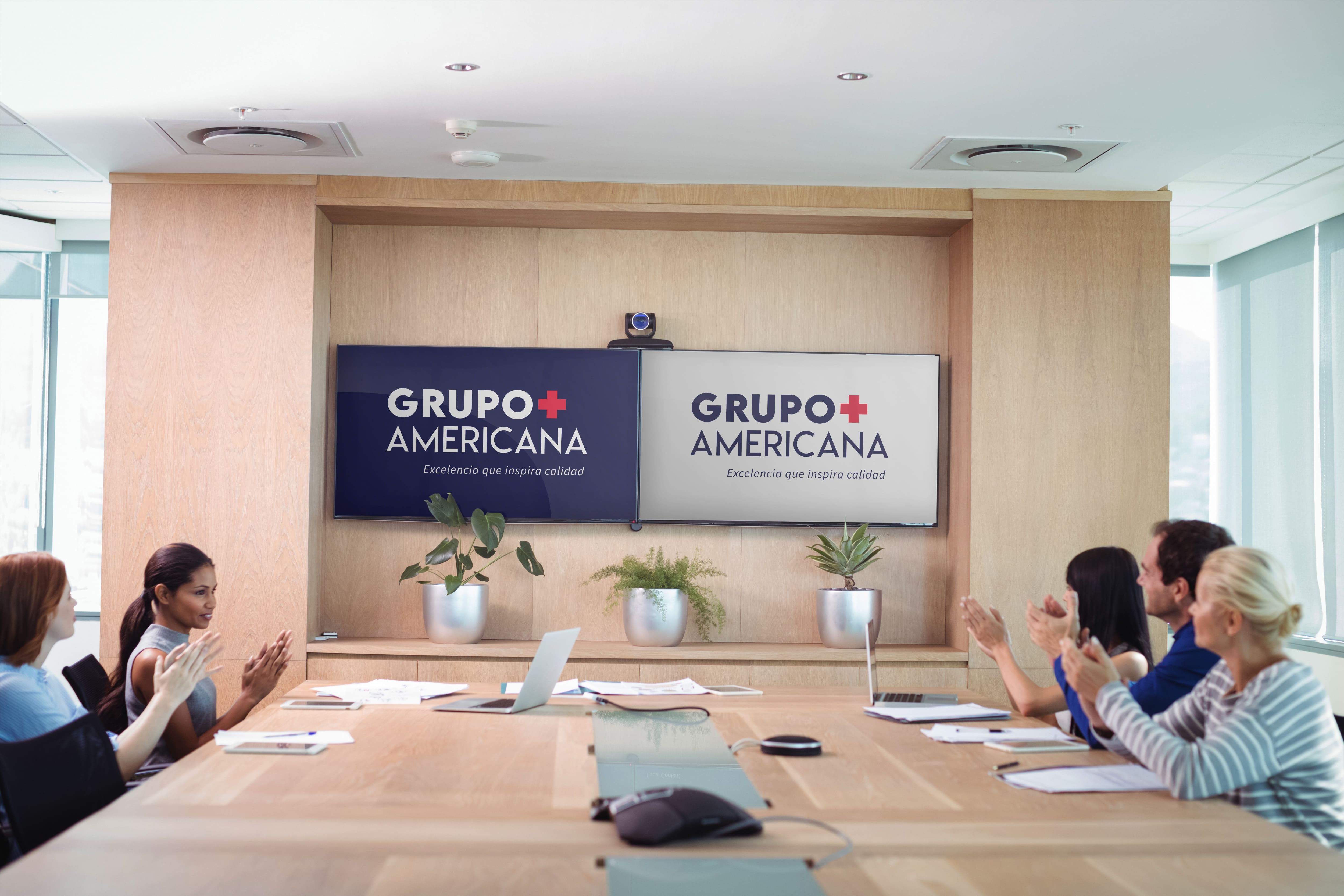
Grupo Americana carried over a century of legacy in pharmaceutical care, but its brand presence did not fully reflect the strength, structure, and trust built across generations. The transition from multiple entities into one group required a clear and unified identity capable of translating its history, scale, and purpose into a modern and coherent system.
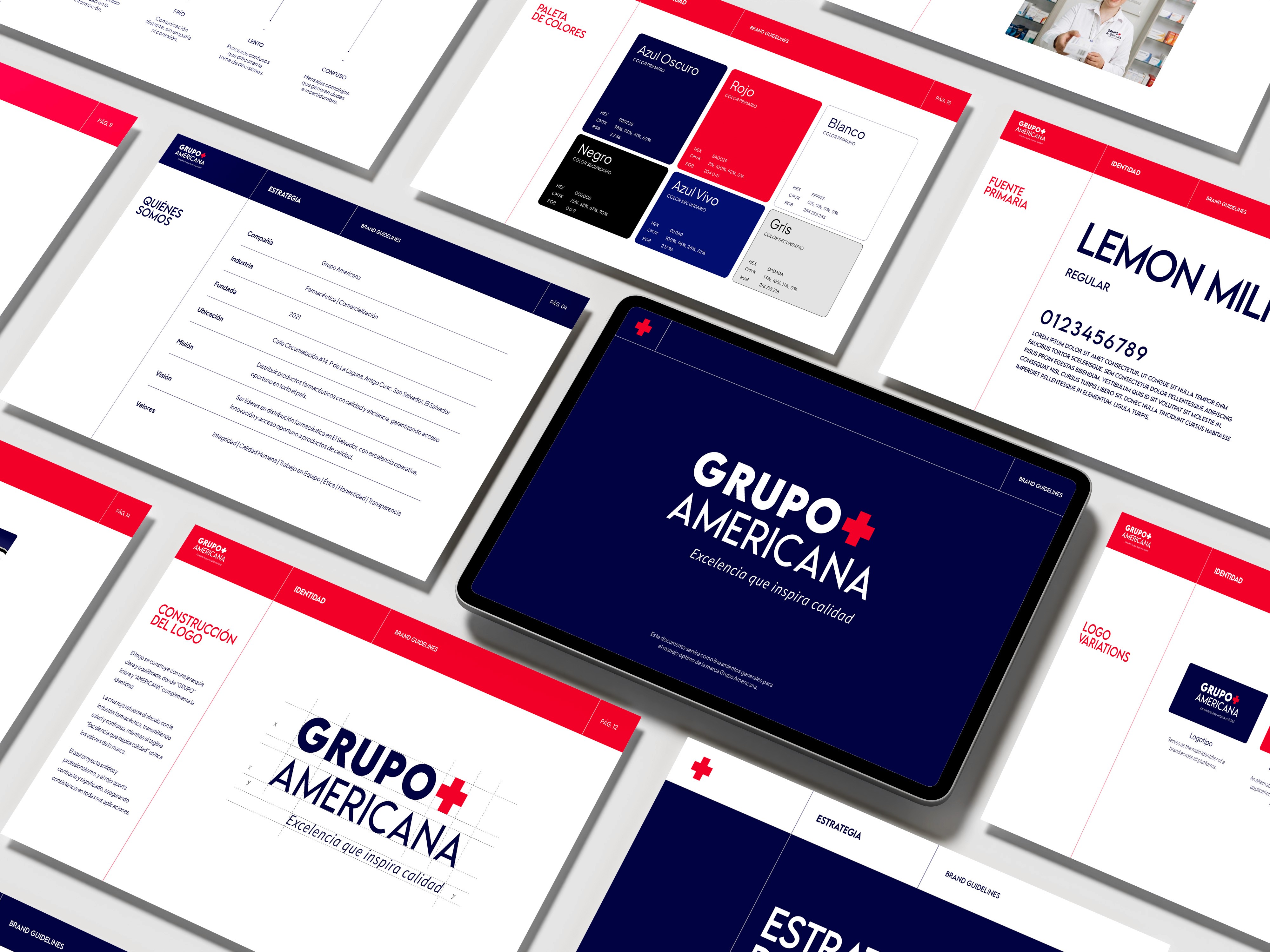
The project focused on simplifying this legacy into a strong visual identity—developing a refined logo, defined typography, and a consistent color system aligned with the pharmaceutical industry. Clean, structured elements and a recognizable icon were key to creating clarity and immediate trust, resulting in a brand presence that feels solid, reliable, and aligned with its role in the Salvadoran healthcare landscape.
year
2023
timeframe
1 month
tools
AI, PS, AE, Figma
01
02

03

see also


