Trans-Express
Social media graphic line redesign for american logistics brand, delivering business information in a fresher, more minimalist way.
00

Problem
The heavy graphic style and elements used across the brand’s content were the main issue affecting social media consistency. The feed felt dense, with little breathing room, and lacked real interactions between the products and people. Users needed to see those experiences to connect with the brand and feel confident engaging with Trans-Express.
Solution
A clean, fresh approach focused on showcasing experiences rather than just products or purchase guidelines. Less copy, but more purposeful—giving users exactly what they need to say, “Yes, I’ll ship my products from the USA with them.” Stronger contrast between whites and blues was used to create a more effective stop-scrolling impact.
Trans-Express is a logistics leader with 40+ years of experience, offering reliable international shipping backed by strong coverage in El Salvador. Its shift to a more strategic and consistent digital presence improved service communication, strengthened connections with users and businesses, and reinforced its role as a trusted global partner.
Even well-established brands benefit from refining how they show up digitally—clarity and consistency make a measurable difference.
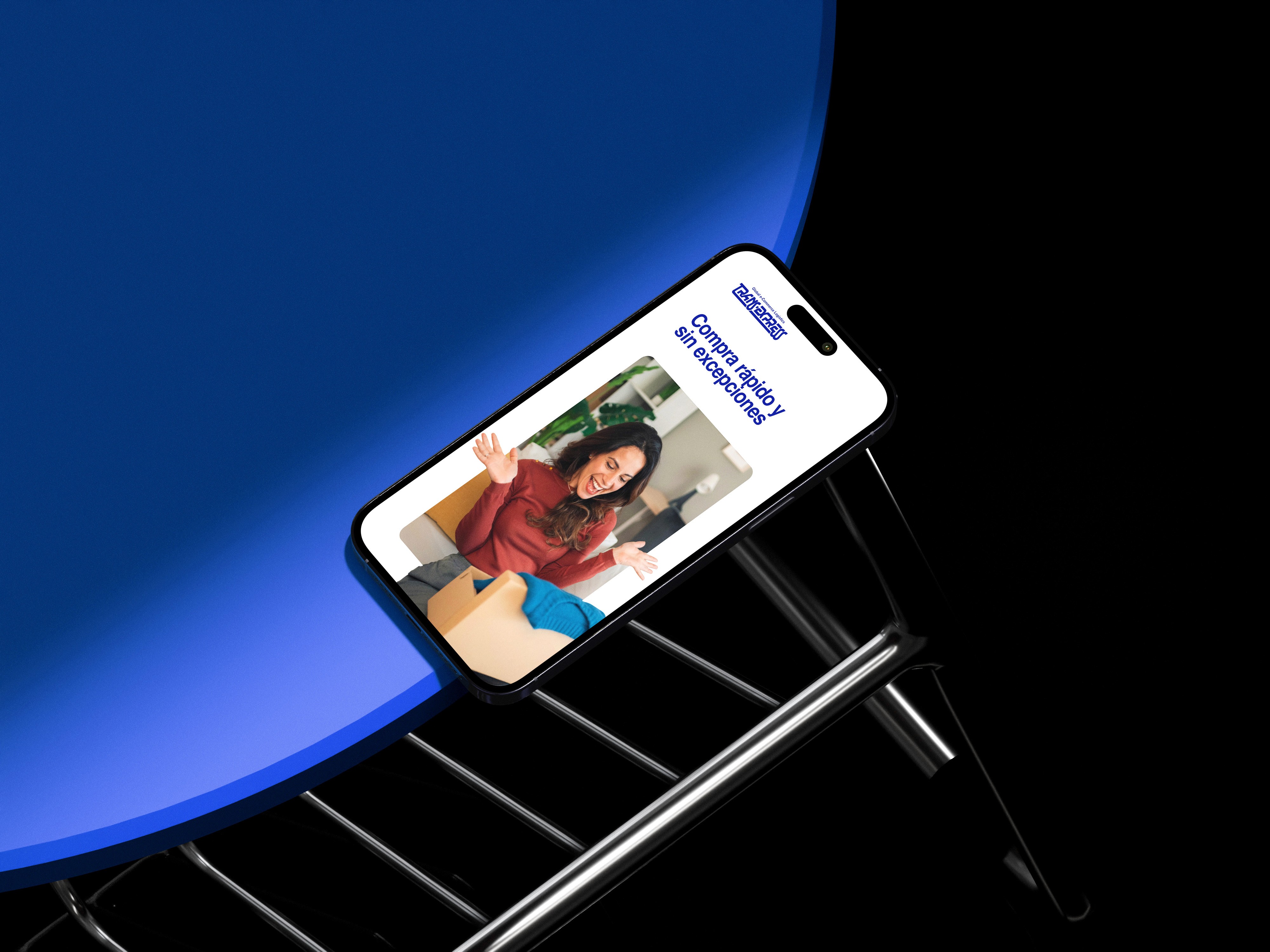
Exploring a cleaner style—aligned with the client’s vision—led the brand to experiment with solid backgrounds, more lifestyle-driven imagery, and sharper contrasts to deliver a simpler message: “We handle your purchases—leave the work to us.”
This simplification significantly improved the user experience, making messages and visuals clearer and interactions easier. The result came from a strategy built on concise, effective copy and easy-to-digest visuals.
year
2019
timeframe
6 months
tools
AI, PS & Figma
01

02

03

see also


